What Are Progressive Web Apps (PWA’s)?

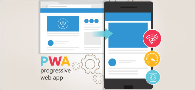
The web is a magnanimous platform that connects billions of devices and operating systems. Progressive web apps use the latest technologies and provide us with brilliant web and mobile apps. It was in the year 2015 when progressive web apps were introduced. Due to the ease of development, it attracted the attention of many users and also has a great application’s user experience. It creates a website very similar to an app-like experience by whoever uses it. You can also deploy it as an app that can be seen on the app store. Let us see what is required to make an app which is considered as a progressive web app:

  • It should be progressive because it has to work ok with every user and every browser.
  • The app must be responsive so that it can be accessed from any desktop, tablet, mobile, or any gadget.
  • It should be capable enough to be independent of internet connectivity. It should be able to work on low-quality networks and sometimes working offline as well.
  • It should have the navigation and interaction of an enhanced app.
  • Timely updates are taken care of by the service worker update process. This keeps the app fresh and updated.
  • It should be safe, secure, and tamper-proof.
  • The app should be identifiable as applications.
  • The app should be re-engageable and installable. It should be installable even without the help of an App Store.
  • The app should be linkable so that anyone can share it very easily with the others by forwarding just a single link.

The Future Of Web Applications

Progressive web applications are considered as the future of web applications. This is because they have properties like native app flexibility, high performance, easy to fix errors and bugs, lightning-fast speed, seamless integration, offline access, and high user engagement. To see the practical effectiveness you need look no further than some of the most popular adult sites on the net. Adult content and adult dating sites were early adopters of PWA’s. For example, the SkipTheGames app was developed as a PWA to provide better user experience and they saw the visitors jump 20 percent. This is an adult site battling in a fiercely competitive space for coveted adult web traffic that utilized a progressive web app to ultimately get more users.

A very important characteristic of a progressive web app is that it must work on all devices and browsers. By using web languages like HTML along with JavaScript this is possible. The inbuilt applications on the home screen of your mobile phone will always work regardless of any network connection. These apps are launched in their standalone experience. These apps on your phone interact with the data stored on your device, they also can read and write files from the local file system, they can access hardware connected via USB Bluetooth or any other means. They can also access your events, contacts, and all the data on your phone. When you use the service workers and also web app manifest the application you develop out of this will be much more applicable and reliable. The users will have an amazing experience. The progressive web pages have made a 65% increase in pages per session on Twitter. There was also a huge increase in the subscriptions daily activity of the users and many more. At this time it is really hard to imagine any mobile web app design without progressive web application.

Top Web Design Trends

With technology taking quantum leaps forward every year, trends in web designing are also getting a makeover. The internet has changed a lot over time and web designing is becoming an increasingly creative sphere requiring new and innovative ideas and designs.

Color: Color is the most important of all the elements on a website. It helps brand the website and also creates the mood for the visitor. Nowadays, one of the emerging web design trends is that of black and white web designs which help make a strong statement or impression. Photographs and visuals in black and white shades stand out much stronger and clearer than regularly colored ones.

Organic Shapes: Another emerging web design trend is that of natural and organic shapes rather than the basic geometric ones that are commonly utilized in web designing. Natural and organic shapes get rid of the rigidity in the designing of the web page and introduce a sense of seamless fluidity which gives a new perspective to the web page. The goal is to make web designs feel more alive by illustrating movement using free drawn elements instead of rigid shapes and lines.

Chatbots: A popular design trend now is that of including chatbots in a seamless and effective way on the website with more levels of customization which help in interacting with the user personally and make the web page seem more friendly as well as inviting.

Minimalism: One of the most popular and classic of all the web design trends is minimalism. In today’s modern designing trends, minimalism is the most preferred aesthetic for web page designing as it helps get straight to the point without having too many distractions for the viewer. This gives the web page a lot more freedom to space out their content in a clear manner which captures the attention of the viewer perfectly.

Mobile Friendly: With mobile phones becoming the most used gadget nowadays, web designing requires that the web page be mobile or thumb friendly too. Having proper navigation menus that can be viewed through the mobile phone and design elements that stand out in the small screen space of it is important parts of web designing for the web pages of today.

Glitch Art: Glitch art is an emerging web design trend that helps give a futuristic and fun angle to your web pages. This retro design is a hit in the modern web design scene today. Glitch art gives the website a psychedelic look which can draw the viewer’s attention to it and makes the content more appealing.

Bold Fonts: Bold typography is another must-have in web page designing since it helps in highlighting the content of the web page and draws the eyes of the viewer to it. Bold and stylish fonts are a necessity in all web pages for different highlighting purposes.

Animations: Innovative and creative cursor designs and animations on web pages are also great design trends. This makes the most of the human and computer interaction tool which is the cursor. Animations and cursor designs enhance the dynamics of the interaction between humans and digital spaces which appeals to the viewer and creates attention.

Overlapping: Overlapping of common regions, shapes and colors give a different and futuristic vibe to the web page and gets a lot of attention from viewers. Web pages having seamless overlapping of content can help make it look aesthetic and appealing to the viewer of the web page.

Icons: Micro-interactions like beeps or icons indicating notifications can help connect with the user better and this helps in promoting the web page by subtly transferring information to the viewer through mini animations, scrolling, chimes and much more. This also makes web pages seem smarter as well as creative to the user.

Abstract Art: Abstract designs are also very popular trends in web page designing as it gives the viewer a different and surreal experience and also helps connect emotionally with the viewer. Abstract art is one of the best ways to convey a message through your web page as it is not cliched and adds a different idea and perspective to the message being portrayed.

3D Design: 3D or 3-dimensional renderings provide a visual treat to the viewer and helps in engaging him or her with the web page. 3D designs along with fluid animations have the power to give any web page a whole new dimension which is visually interesting as well as appealing.

Gradient: Gradients are one of the best and most favored color trends in the web design scene today. They add an element of fun and help highlight content in a trendy and fashionable yet modern way.

Pictures: Data visualization or picturing information with the help of animations or pictures can help in easily conveying complex ideas and information to the viewer and is one of the emerging trends in web page designing.

All of these trends give a facelift to any web page so it is more attractive and appealing to the user whilst helping connect with them better too.

How to Optimize Websites For Mobile Traffic?

More People Are Accessing Websites Through Mobile Devices Everyday

The number of people using mobile devices has been increasing for the last decade. Almost every other person uses a smartphone these days and they use it for surfing the web and researching various websites and the pages within them. Therefore, it has become necessary for people to create websites which are optimized for mobile search traffic. They need to make sure to use the tools and techniques to make the websites, mobile friendly or else they might not be able to get a higher Google ranking for their site.

What is mobile website design?

Mobile website design means that the website is properly optimized to be viewed on any screen of any size. The site should fit the screen of any device properly so that reading the information becomes easy and clear. The users should not have to use the zoom option on the screen all the time or else they will not be interested anymore.

Before optimizing the websites for mobile devices, it is important to know about the visitors on the website, how they use the site, what device they use the most, get feedback from the visitors, etc. The site should load quickly and should have a better interface so that everything important is easily trackable and it should also have comfortable aesthetics without too much stimulation in one single place.

Steps to consider while optimizing the website for mobile searching

Now that is clear that having a mobile-optimized site is very important to make it successful and popular among viewers and visitors, one needs to follow certain considerations clearly as well.

There are some ways that can be used to improve the website and to keep a check on its performance. The points to keep in mind are:

  • Use a responsive website theme

When one is creating a website using WordPress, they need to pick a theme that is responsive and works well on all kinds of devices. It should not have any kind of negative effect on website optimization and performance. It should be easily customizable with great, comfortable visuals. Always choose responsive designs by filtering them from the lot and read the descriptions carefully. It is possible to preview how they will look on all devices prior to installation.

  • Use a good website host service

Using the right hosting plan and service is very crucial when it comes to the performance of the website in term of speed and loading. To make sure that the website does not face too much downtime and that it performs well on all devices, especially mobile phones, a web host with better resources and speed needs to be chosen. One should keep the security and safety of the website in mind as well or there can be a hacked website. It is crucial to use a dedicated server for the websites so that there is no downtime, also so that it has optimized speed at times and offers complete control over the safety as well.

  • Use Google’s mobile-friendly tool to test the website

One can either simply use the website on different devices by themselves to check how they are faring in terms of performance, navigation, usability, etc. or a dedicated mobile testing tool can be used to check the optimization of the website even more deeply. The links can be entered for the website on the tool and run to test the mobile friendliness. This will show how the website looks on a mobile screen, along with certain comments which are to be checked and corrected. We did some work with an adult dating app company and making changes and checking them through this tool allowed us to improve mobile optimization greatly. This particular hookup sex website quickly started ranking higher than other dating and hookup sites. The changes were relatively small in the grand scheme of web design, but they had a drastic impact.

  • Quick loading website

People usually hate those websites which do not load quickly and tend to lose their patience and stop using it entirely. Users need to make sure that the speed of the website is optimized and speedy at all times to make sure that they can have a good experience and also that there are minimum bounce rates. Speed test tools can be utilized to check the minimum speed of the loading. Some of the techniques that can help in these loading times are:

  • by using content delivery network servers
  • by using caching techniques
  • through optimizing the website code
  • by compressing the pictures and images on the website
  • By keeping the website up-to-date, all the time
  • Redesign the pop-ups

Pop-ups are one of the most effective ways of marketing and remains the best way to gain the attention of the user. They can be used to relay information to the user or to increase the conversion rates. One can use the pops ups which are strategically designed for mobile screens to minimize user experience disruption and to avoid any kind of Google pop-up penalties. Following the guidelines by Google can help the user to restructure the pop-ups effectively.

People accessing the internet and browsing websites via their smart devices will only continue to grow and become more widespread throughout the world. When it comes to designing and developing a website this factor must be considered. Mobile friendly aesthetics and functions have far reaching implications for ranking in search engines and it seems like that will continue to gain weight as a factor in determining rank for given search queries as users continue to access the internet through mobile devices.

How To Create An Online Shop

E-commerce websites are currently ruling the internet and have taken the bliss of shopping to the next level. To add to it, it also has a lot of plus points which makes the ordeal more appealing to the masses. An online shop is easier to access for the customer, plus it saves time as well as effort on the part of the customers. Who wouldn’t want to save the trouble of going that extra mile for something they can easily acquire sitting in the comfort of their own home?

On the other hand, e-commerce services have proven to be beneficial for both the customers as well as the sellers – it’s a give and take relationship. The chances for your business to boom are two times higher if you decide to give an online store a try. Here’s why – opening up an online shop will give it so much more exposure than a physical shop. The internet is the place where word spreads like fire. Chances are that you are going to be noticed and in no time you will acquire a lot of customers. E-commerce websites are quicker as compared to their physical counterparts. One does not need to worry about the money matters since handling an online shop is a cheaper alternative than the rest.

Fear not, opening an online shop is a lot easier than it looks! With a little forethought and strategizing, you’re all set to welcome potential customers! Read on to find out how you can open your own online shop.

Figure Out Your ‘Calling’

The first thing you should think about is your products and/or services that you are about to advertise in the shop. There are countless products in the market, so you should focus on what sets your product or services apart from the rest. Why would a customer come to your shop if they can get the same product at 298 other shops with a higher rating than yours? So the more unique your product is, the more people you will attract.

In addition to the uniqueness of the product/services, you might also want to analyze the demands of the customers. You can easily find out about these from the latest trends that are going on. Once again, internet searches are the way to go. One of the things that truly appeal to a customer is when their demands are being met. Therefore, you must design products accordingly and in no time the customers will flock to you.

Get Your Hands On The Stock

Once you have figured out your calling you might want to get stock up on your products. There are two things you can do to accomplish this: 1) drop shipping and 2) buying products from suppliers and reselling.
Drop shipping involves a supplier that takes your stock and then delivers it to your customers of your taken orders.

In case there is no supplier and you are the one designing your products then you’ll need investments to build them.

Designing Your Store

Next comes the design of your store. You can hire a freelancer or an agency to design what you have envisioned for the store. Before you proceed with this step, you need to make sure you’re the one in charge of the site through the Content Management System (CMS). In this way, you don’t have to keep paying a developer for the job.

You can always create an online store by yourself provided that you have the tools for it like an online store builder. Squarespace, Bigcommerce, and Shopify are some options that provide free trials that you can use.

Advertising Your Services

Online advertisements are a great way to be noticed and to show off the products. In this way, you can promote your online shop and get more clicks and buyers. You can advertise through Facebook ads and increase the visibility of your store and reach more people that are interested in products/pages like yours. Facebook ads help you score the target audience, thus increasing your business by leaps and bounds.

Blog Updates

It is essential that you keep on updating your shop or site with information about your new products and services. Blogs are the best route to achieve this since you can blog about the experience related to your products. By doing this you will manage to grab the interest of your potential customers and hook them into clicking onto your website.

Make sure to create a keyword-rich blog as the quality of the blog plays a major role in promoting your business. Techniques such as inbound marketing are preferred when it comes to creating blogs as it boosts your chances of being visible to the audience when they search up something related to your product.